A grey banner with a red swoosh line.
The Cotenda logo.

The Task

Cotenda is a pioneer in developing technologies for enhancing health and community wellbeing, has garnered acclaim for its innovative swimming pool accessibility products.

The company's commitment to inclusivity and high-quality design was solidified through a significant partnership with the 2012 London Olympics, leading to international recognition.

Our mission revolved around shaping Cotenda's brand identity for their swimming pool accessibility products, employing our creative design process and strategic planning to uphold accessibility as a core value and generate a big impact.

Client

Cotenda

Services

Brand Identity

Brand Guidelines

Print Material

Web Development

The Cotenda poolpod buttons.
Someone using the Cotenda PoolPod.
The Cotenda Poolpod 2.0 poster.

The Logo

Cotenda’s brand identity was crafted to reflect its commitment to innovation and inclusivity. The initial emphasis on a contemporary mark logo aimed at seamless integration with various sub-brands. The design underwent a transformative process, adopting a clean geometric style infused with organic elements.

The brand's logotype evolved from a font, undergoing significant revisions to emerge as a distinct symbol. Inspired by the organic shapes inherent in Cotenda’s products, particularly the Poolpod, the incorporation of a sweeping 'C' shape paid homage to its origins. This motif was extended across various visuals, imparting dynamic motion to relevant materials.

Three versions of the Cotenda logo in grey, black and red.
Cotenda logo.
The Cotenda brand guidelines.

Colour Palette

Strategic planning helped guide the selection of a lively yet harmonious color scheme. The dominant red, accompanied by subtle hints of pink, injected the brand with an emotive resonance. To maintain equilibrium amidst this vibrancy, neutral shades such as dark and light grey were introduced, ensuring a seamless and balanced integration of colours.

The Cotenda logo.
The poolpod social media accounts.
The Cotenda brand guidelines.

Sub Brands

Each of Cotenda’s groundbreaking products received its own distinct sub-brand, featuring the core Cotenda mark alongside the product name. Given the prevalence of 3D models in digital and print materials, meticulous attention was devoted to seamless integration of brand elements with the product visuals, reinforcing brand recognition and product association.

The Cotenda product range.
The Cotenda logo.

Conclusion

Cotenda’s brand case exemplifies a holistic approach to brand development, marrying innovation, inclusivity, and design excellence. The evolution of its identity, coupled with a purposeful visual language, has not only addressed specific challenges but also positioned the brand as a trailblazer in improving accessibility and wellbeing for communities worldwide.

Mucky Puddle can assist you in elevating your brand by leveraging our deep understanding of market trends, consumer behavior, and design principles. Whether it's refining your brand identity, creating impactful visual elements, or devising comprehensive branding strategies, we are dedicated to guiding you towards a resonant, memorable, and influential brand that connects meaningfully with your audience and drives lasting impact. Why not drop us a line?


Related Brand Projects

We've picked some projects that we think you might be interested in.
Why not take a look?

Hulley and Kirkwood branding on the side of a building.
Logos Logistics logo.

HAVE AN IDEA?

Do you need help with your brand?

Please don't hesitate to drop us a line if you require branding services for your business.

Brewgooder mobile website.
Arran Aromatics fragrance finder.
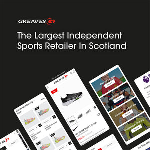
The Greaves Sports mobile website product and collection page.
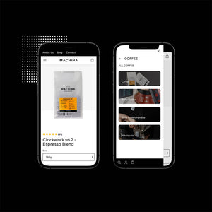
The Machina Coffee 'For Business' website page.
Discover Lanark shield icon.
Discover Lanark graphic.
Greaves Sports home page.
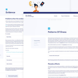
Our Health Our Knowledge website.
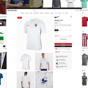
The Greaves Sports product page.