A pipe band.
The National Piping Centre logo.

The Task

The National Piping Centre stands as a beacon of excellence for the bagpiping on both national and international fronts. Offering top-tier bagpipe education, exquisite Scottish cuisine, luxurious accommodations, a spacious event venue perfect for weddings, and the Museum of Piping showcasing the treasures of the piping world, it is a hub of cultural significance and musical heritage.

The National Piping Centre sought our expertise due to inconsistent and unstructured brand assets that lacked cohesion. The existing detailed logo struggled with legibility in smaller formats, prompting the need for a refined and simplified design strategy.

Client

The Piping Centre

Services

Brand Identity

Brand Guidelines

Web Development

The old and new National piping centre logo.

Logo Refinement

A refined and simplified version of the primary logo mark was meticulously redrawn to enhance legibility and versatility across various applications. Multiple logo variations were created to ensure improved readability and adaptability, catering to diverse use cases and sizes.

A range of colour palettes.
A bagpiper.
The Piping Centre course information page.

Brand Elements

The brand's colour palette underwent a refresh, introducing a set of secondary colours to complement and expand the visual identity. Inspired by The Piping Centre tartan, a dynamic graphic motif was developed for application across web and print materials. This motif cleverly combined multiple overlapping shapes, patterns, and colours, resulting in a modern and captivating visual element.

A versatile graphic system was established, allowing for a spectrum of visual expressions from bold to subtle. The typography was refined, with Open Sans selected as the primary font for its adaptability and legibility.

The National Piping Centre motifs.
The National Piping Centre desktop website.
The National Piping Centre asset guidelines.

Conclusion

Through a through process of logo refinement, colour palette expansion, the creation of a striking graphic motif, and typography enhancements, the National Piping Centre underwent a comprehensive brand refinement. This transformation ensured a cohesive, adaptable, and modern visual identity that resonates with its cultural heritage while catering to contemporary design needs, solidifying its position as a distinguished centre for bagpipe education and cultural celebration.

We excel in transforming brands by refining visual identities for consistency and impact. Our expertise includes logo refinement, color palette expansion, and creating dynamic graphic motifs that resonate with your brand essence. Let us elevate your brand's presence with a refreshed and cohesive identity. Why not drop us a line.


Related Brand Projects

We've picked some projects that we think you might be interested in.
Why not take a look?

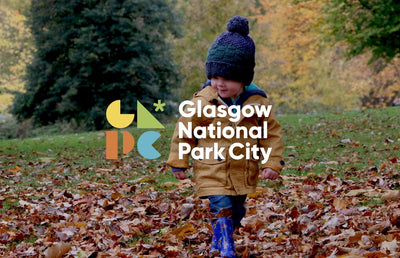
Glasgow national park city banner with a child playing in leaves.
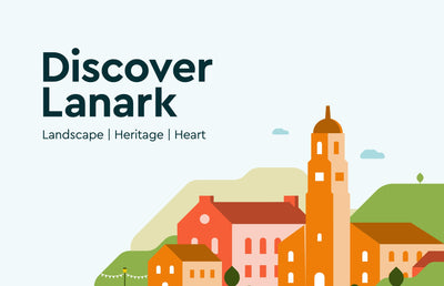
The Discover Lanark Landscape banner.

HAVE AN IDEA?

Do you need help with your brand?

Please don't hesitate to drop us a line if you require branding services for your business.

Arran Aromatics product page.
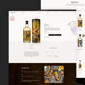
Douglas Laing product page.
The Machina desktop website.
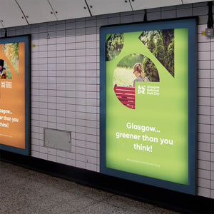
Glasgow National Park City subway banner.
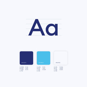
Our Health Our Knowledge font and colour library.
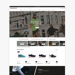
Greaves Sports: The Largest Independent Sports Retailer In Scotland.
Greaves Sports home page.
Glasgow National Park City brand material.
The Mademoiselle Macaron tower builder on the mobile website.